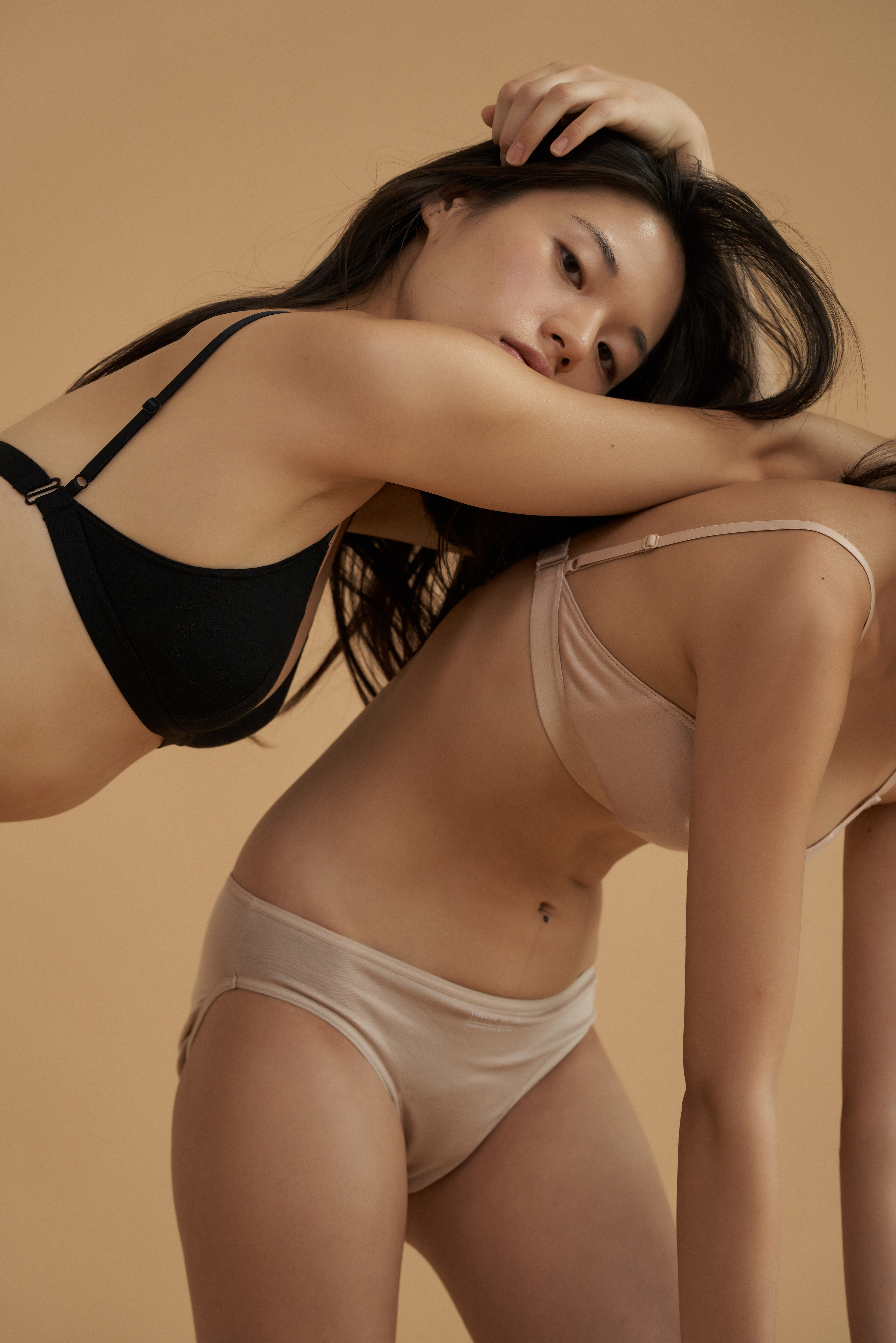
CFC has developed visual Identity and packaging design for women's period-proof underwear brand 'vivevive'.
‘vive’ is a word that means ‘hurrah’ in French, 'life' in Spanish.
Design keywords for the brand mood was simple.
1. sophisticated yet joyful
2. elegant yet witty
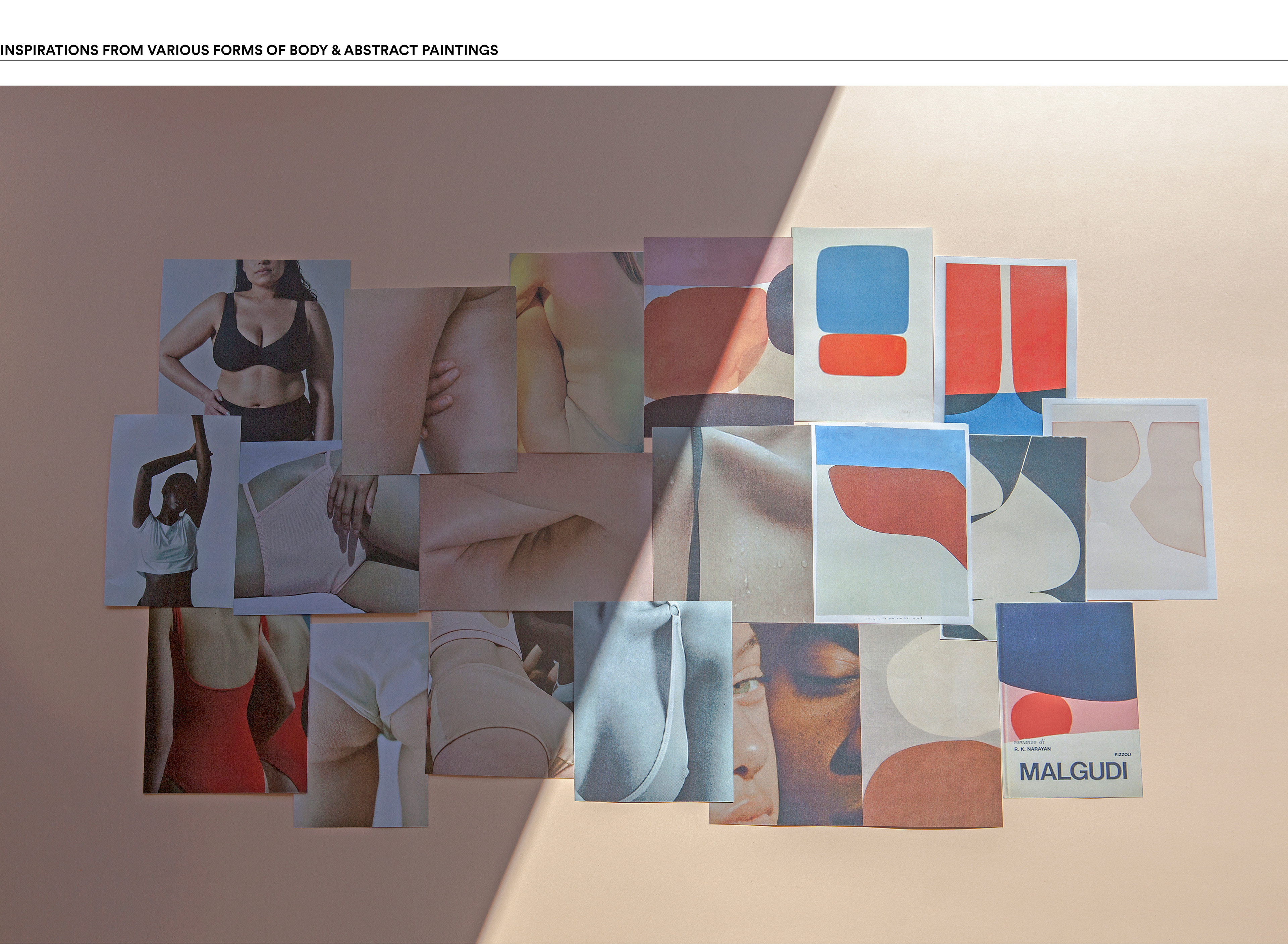
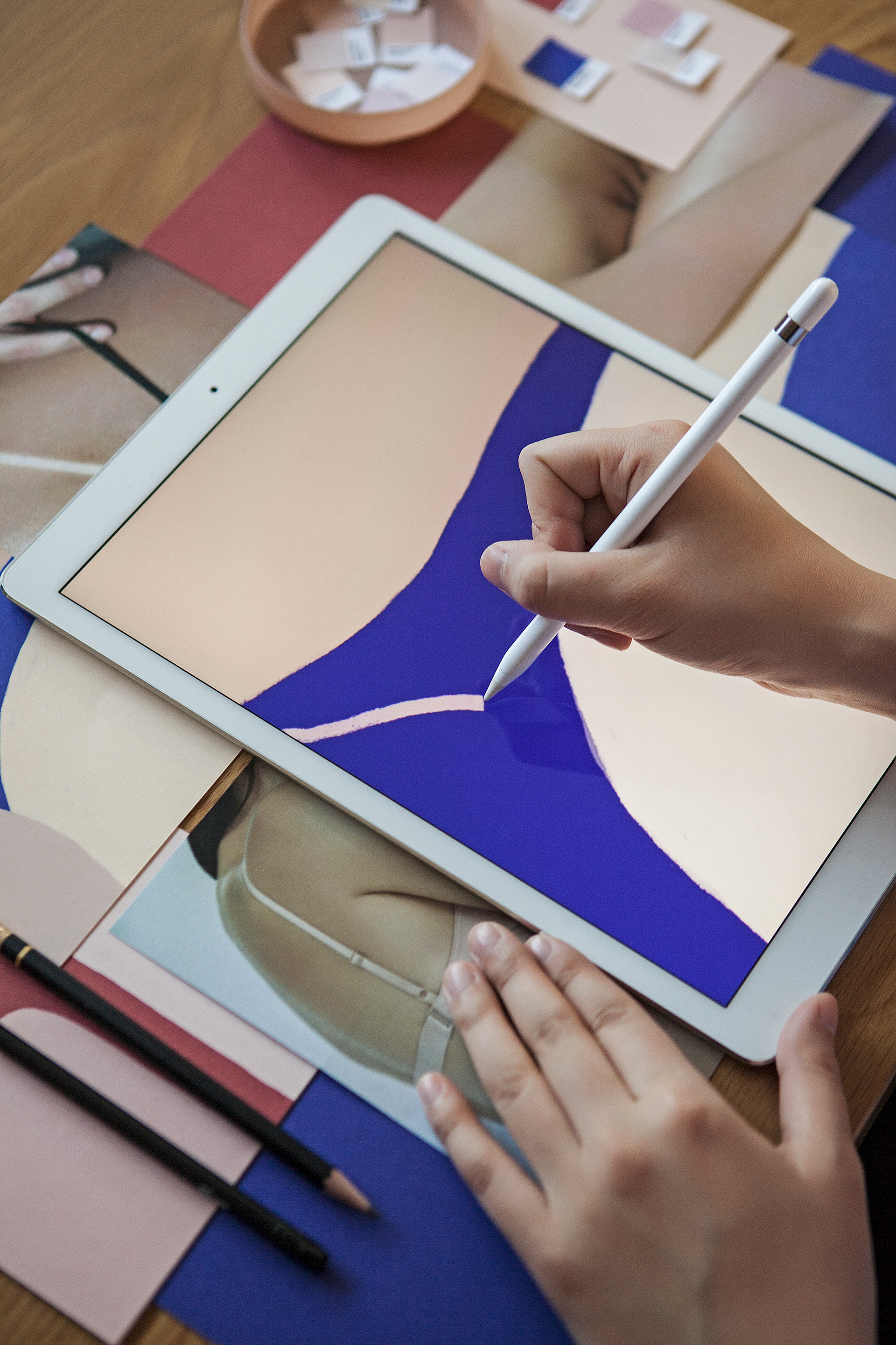
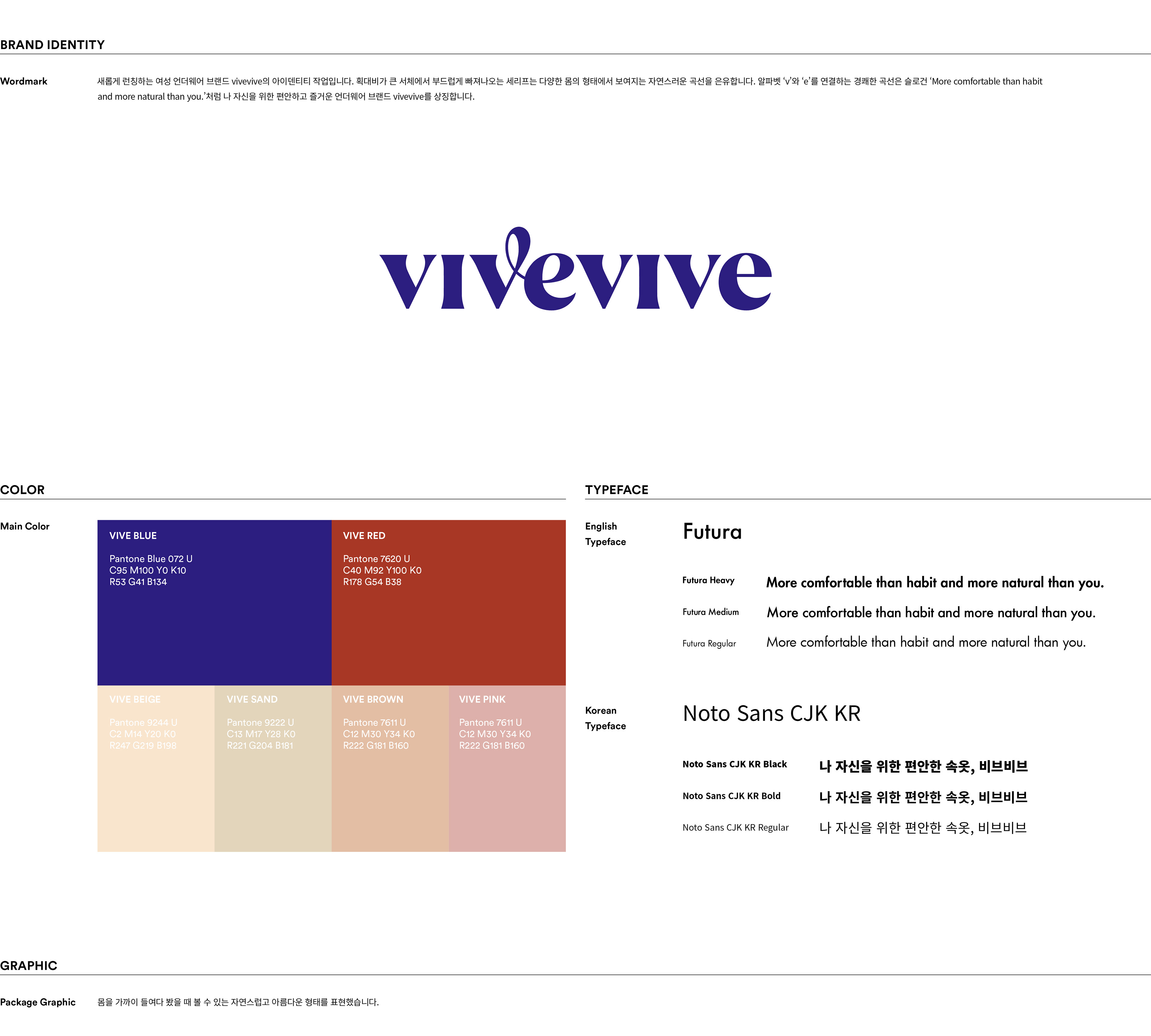
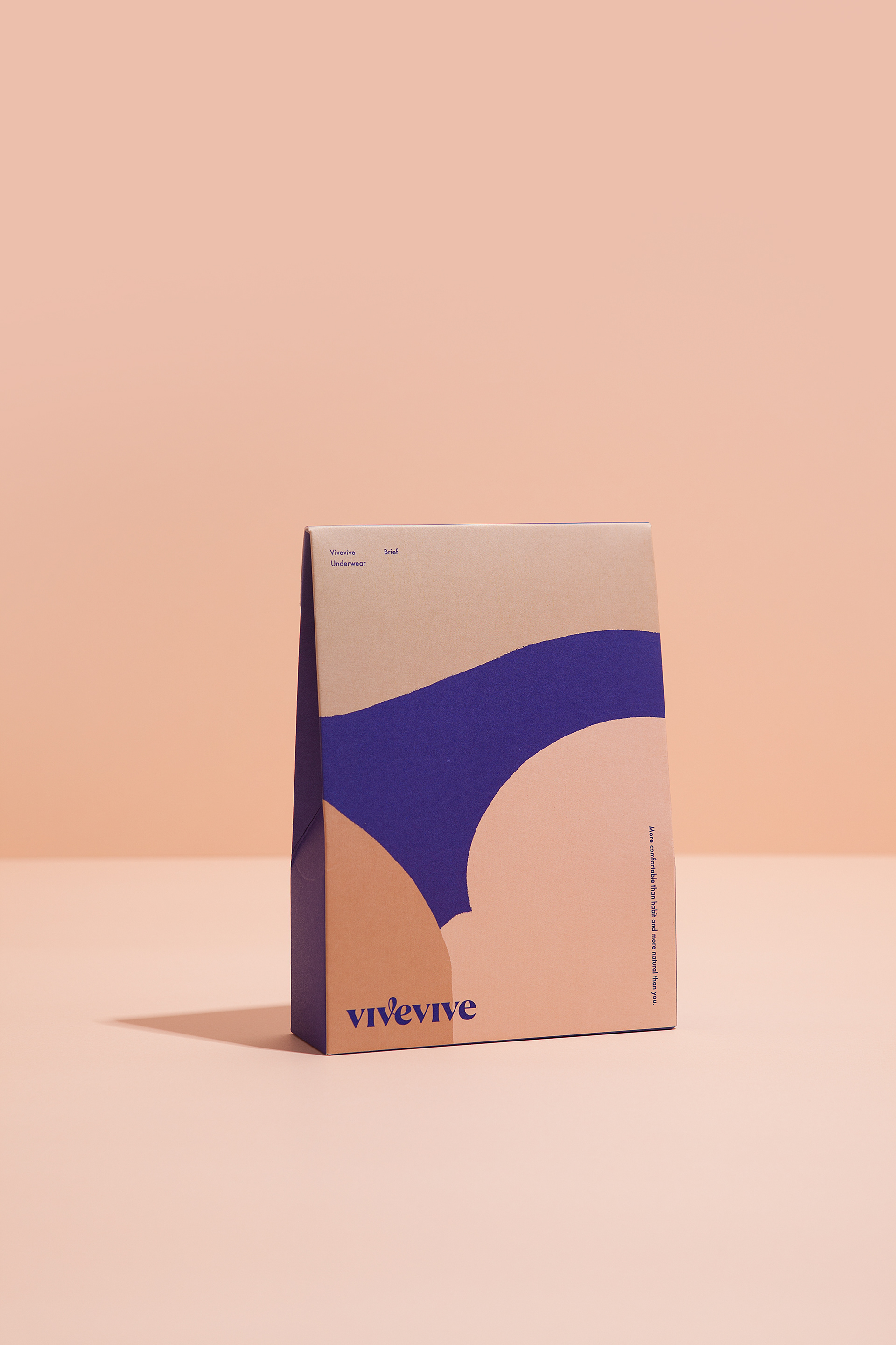
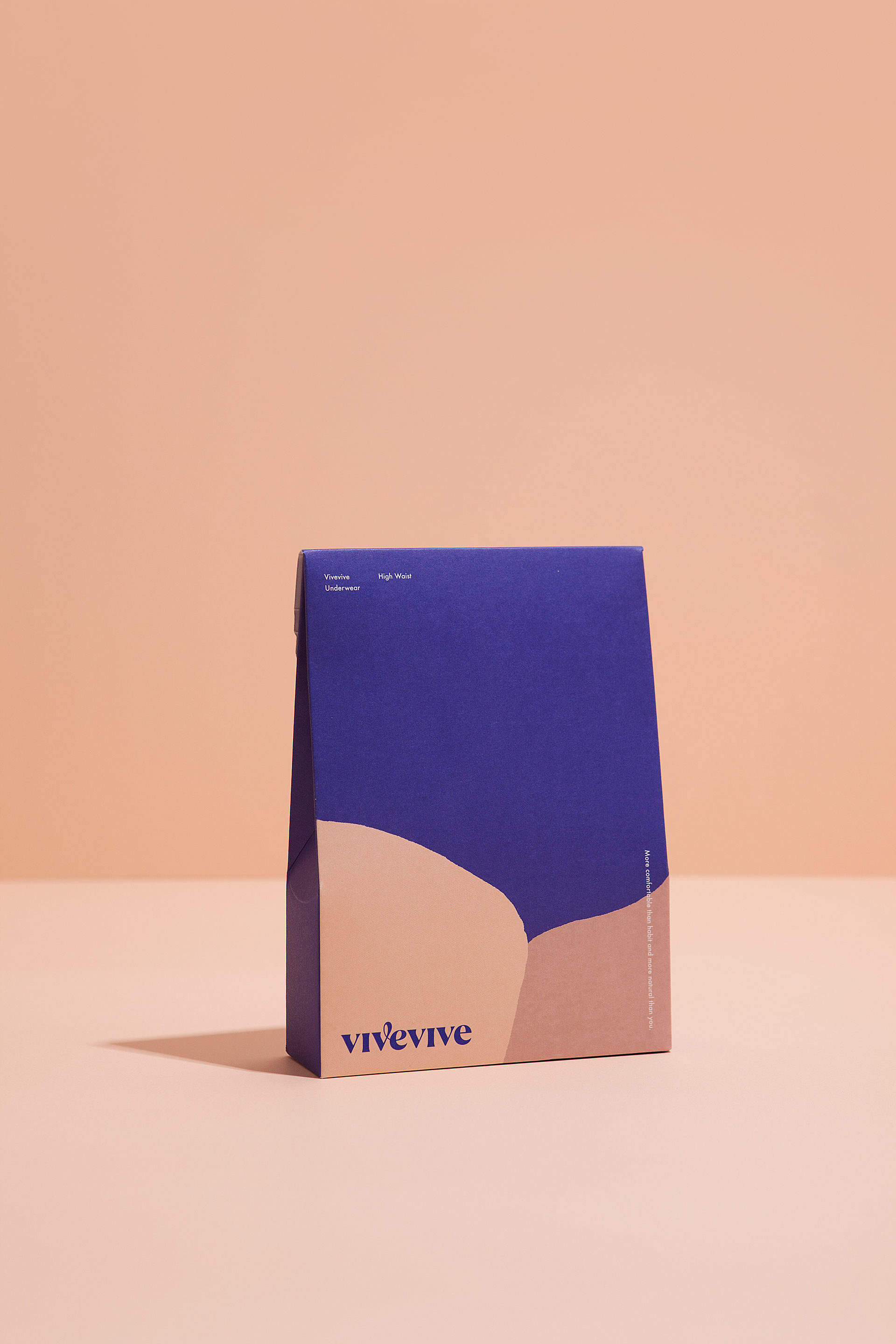
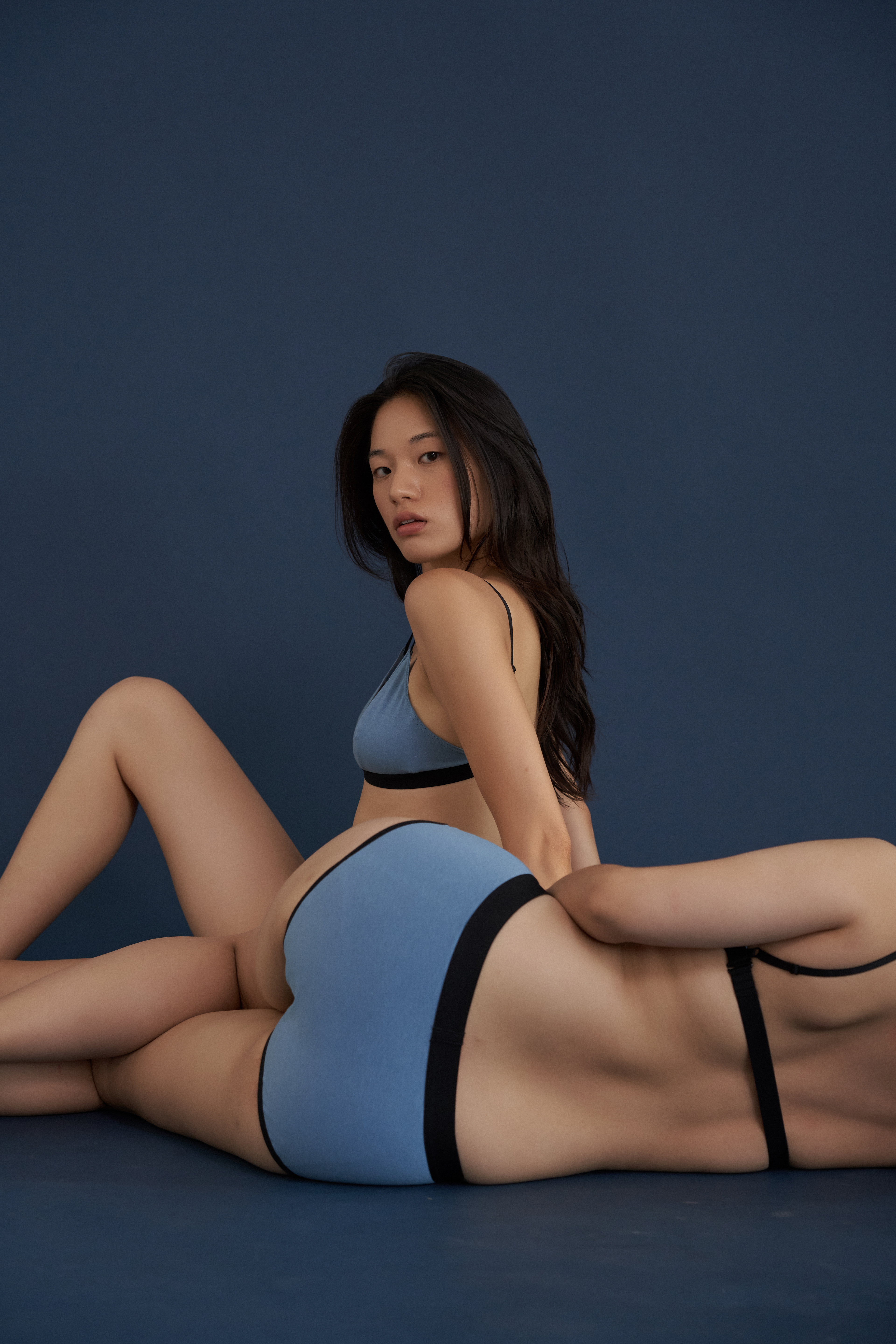
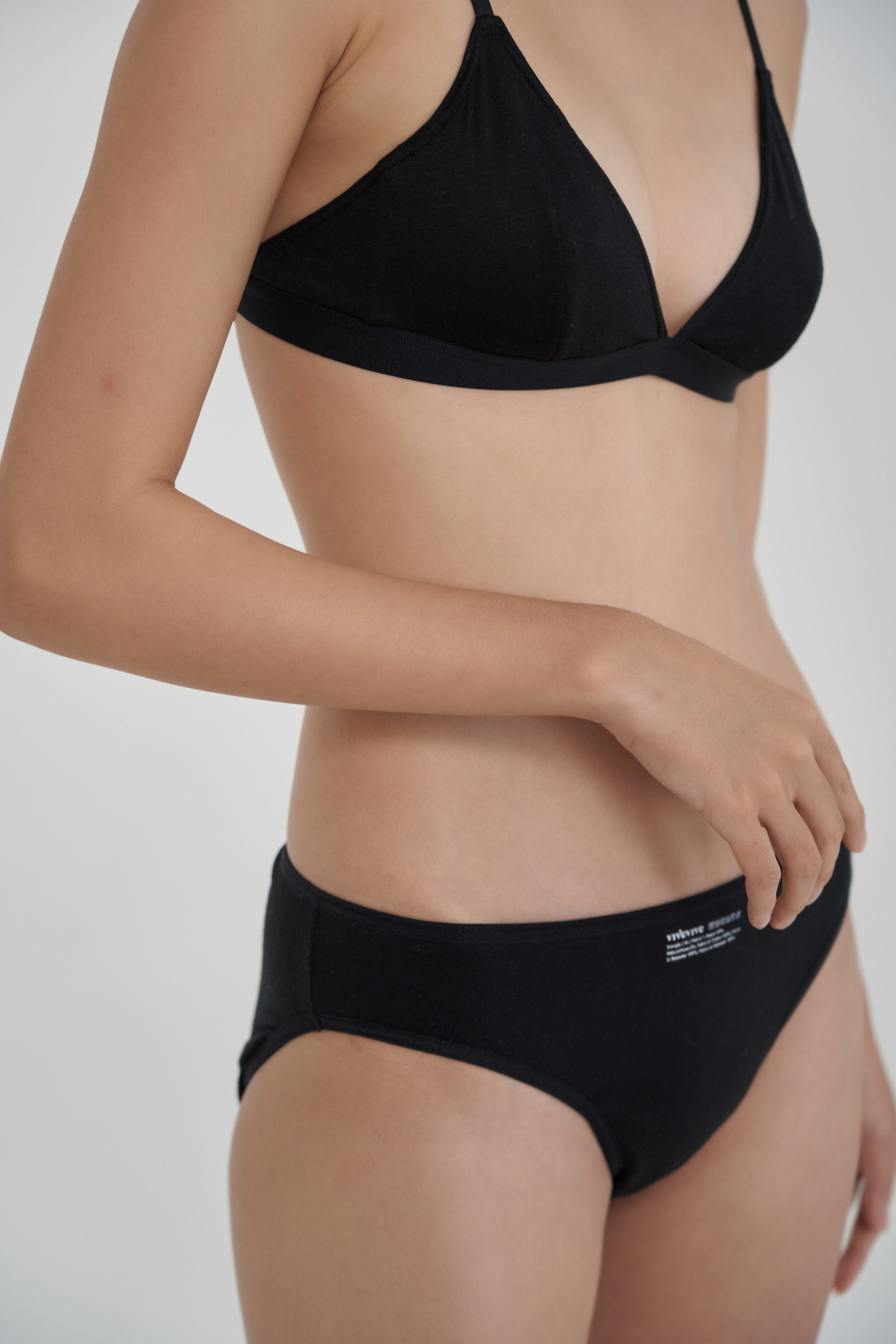
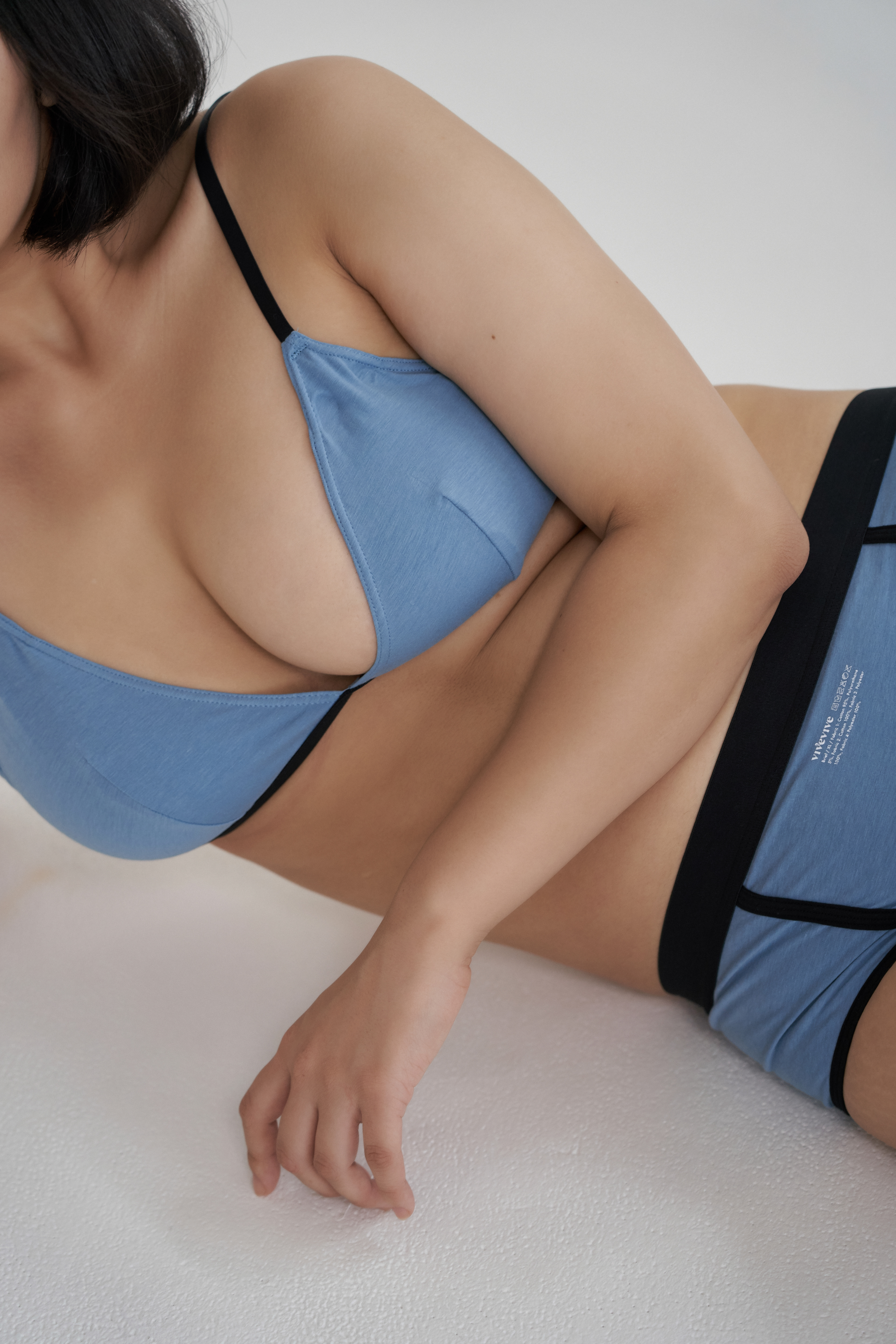
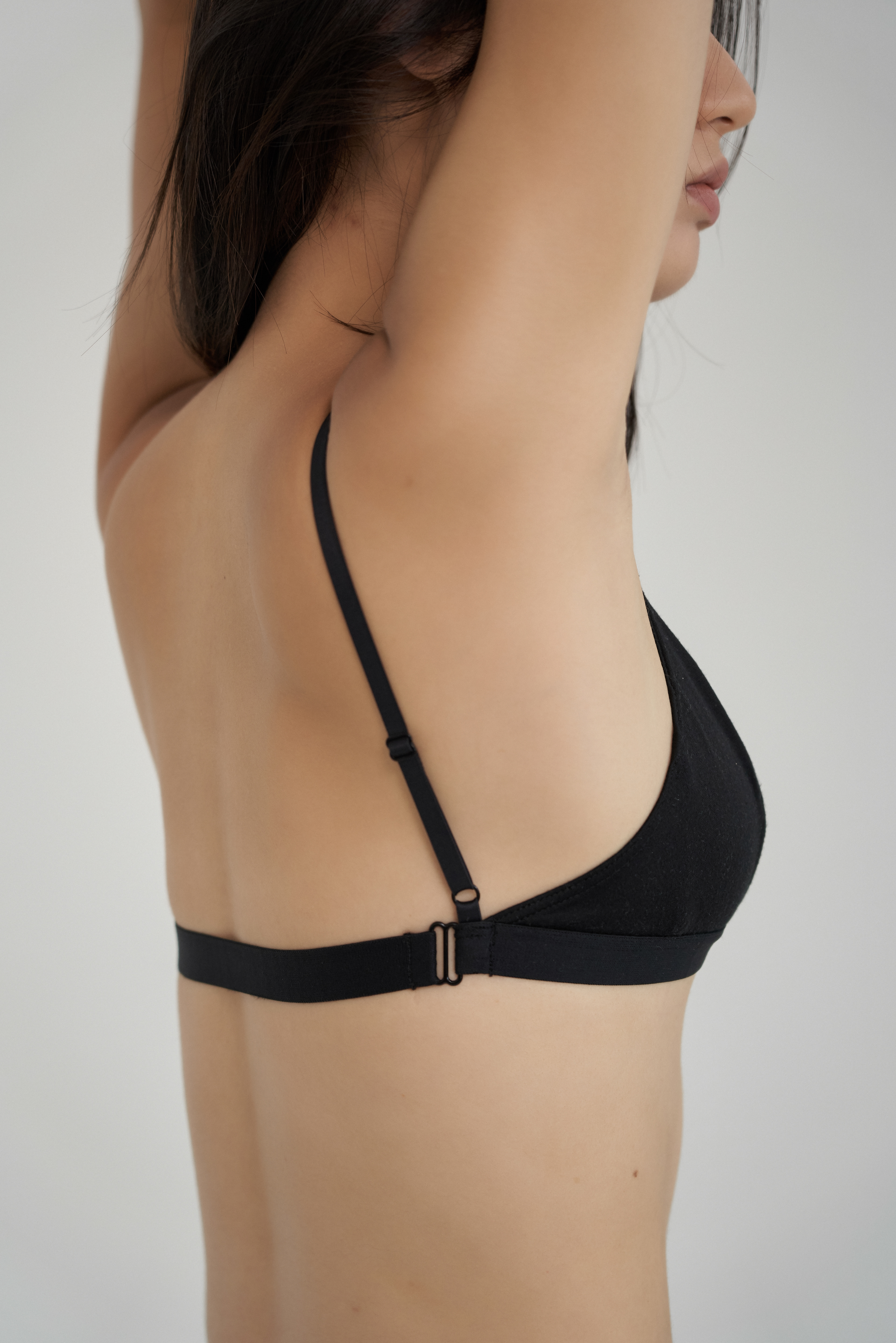
Starting from the belief that the most natural body is the most beautiful, we created a graphic that abstractly expresses the natural curve of the female body. The cheerful curve that connects the letter ‘v’ and ‘e’ in wordmark symbolizes positive mind, like the slogan 'More comfortable than habit and more natural than you.’


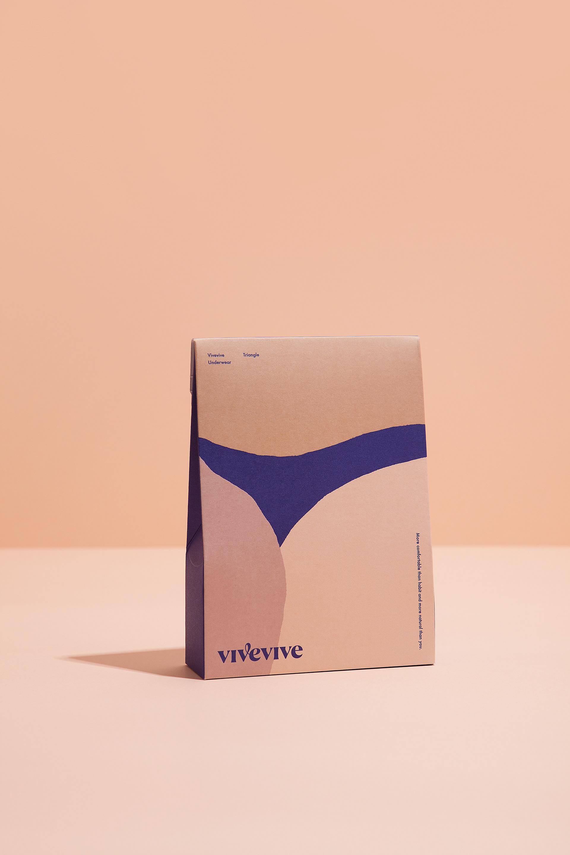

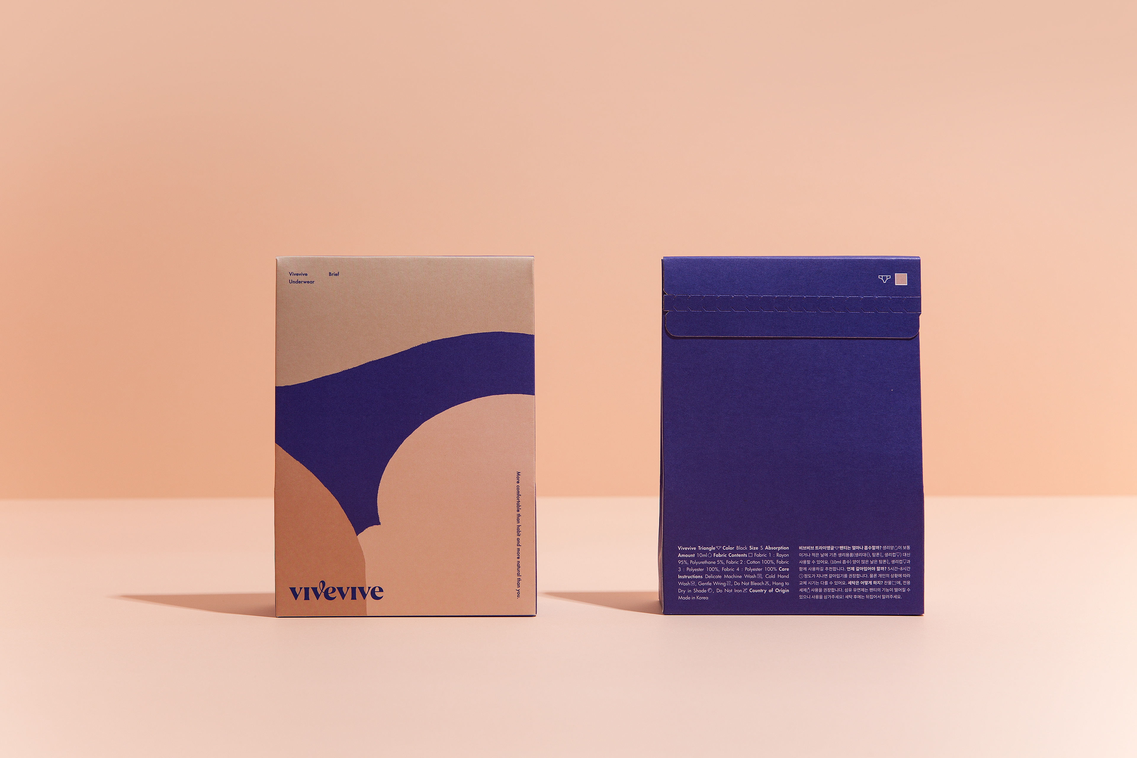
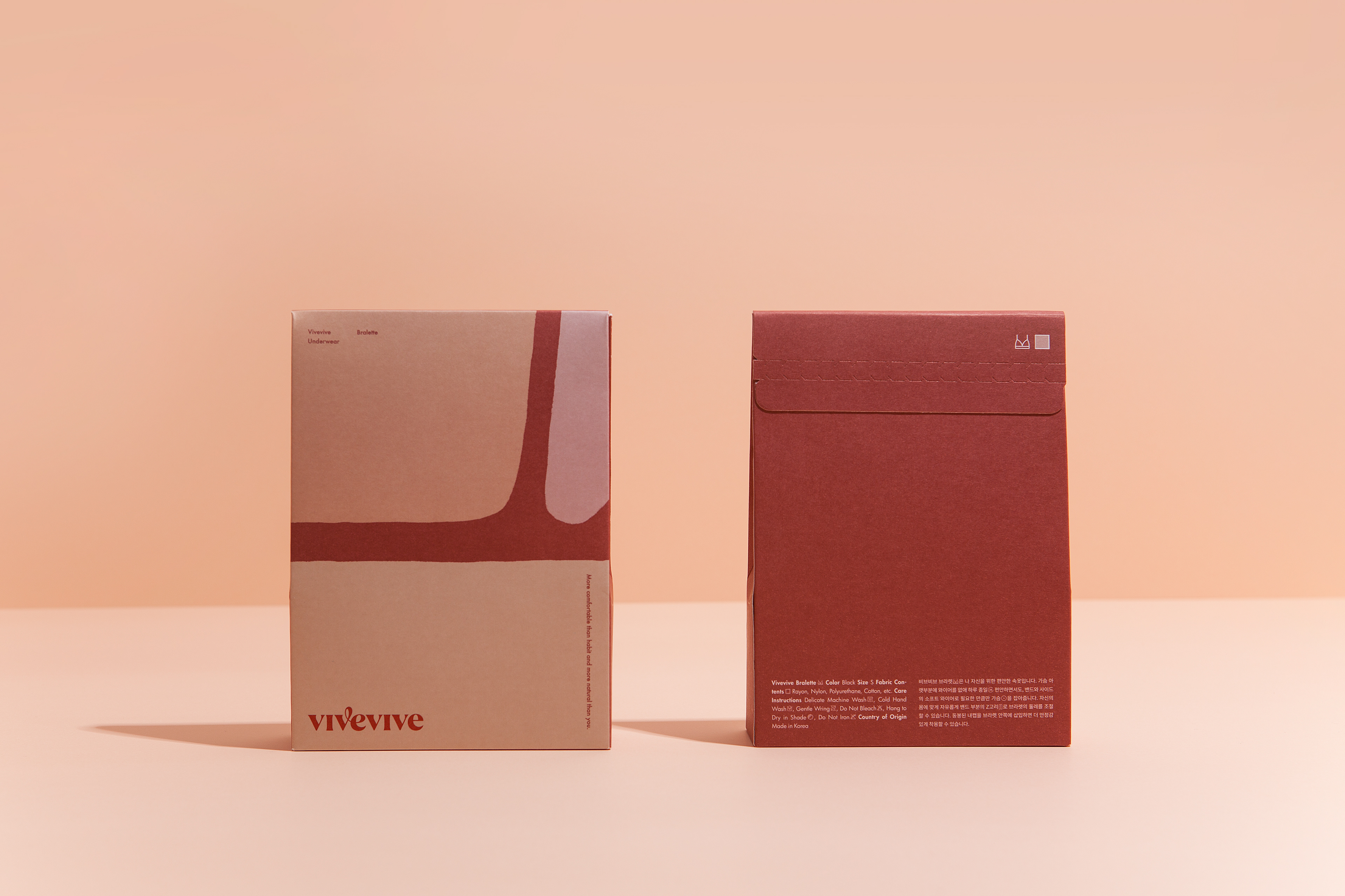
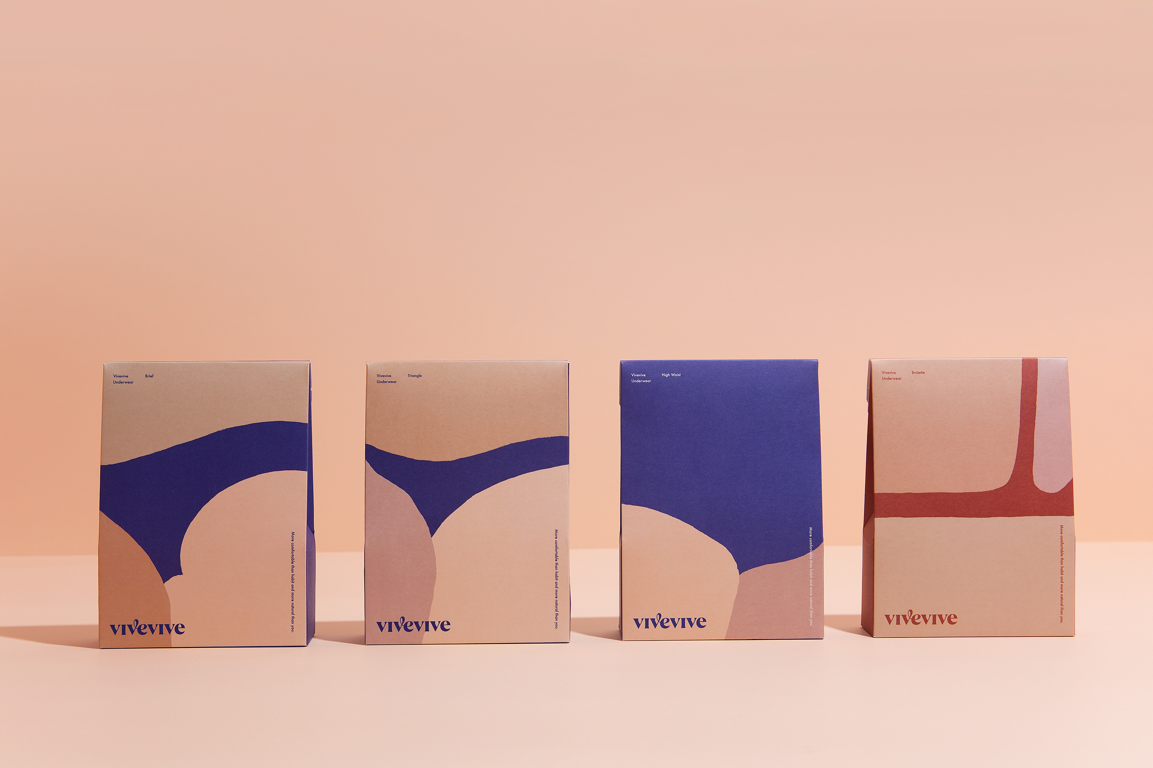
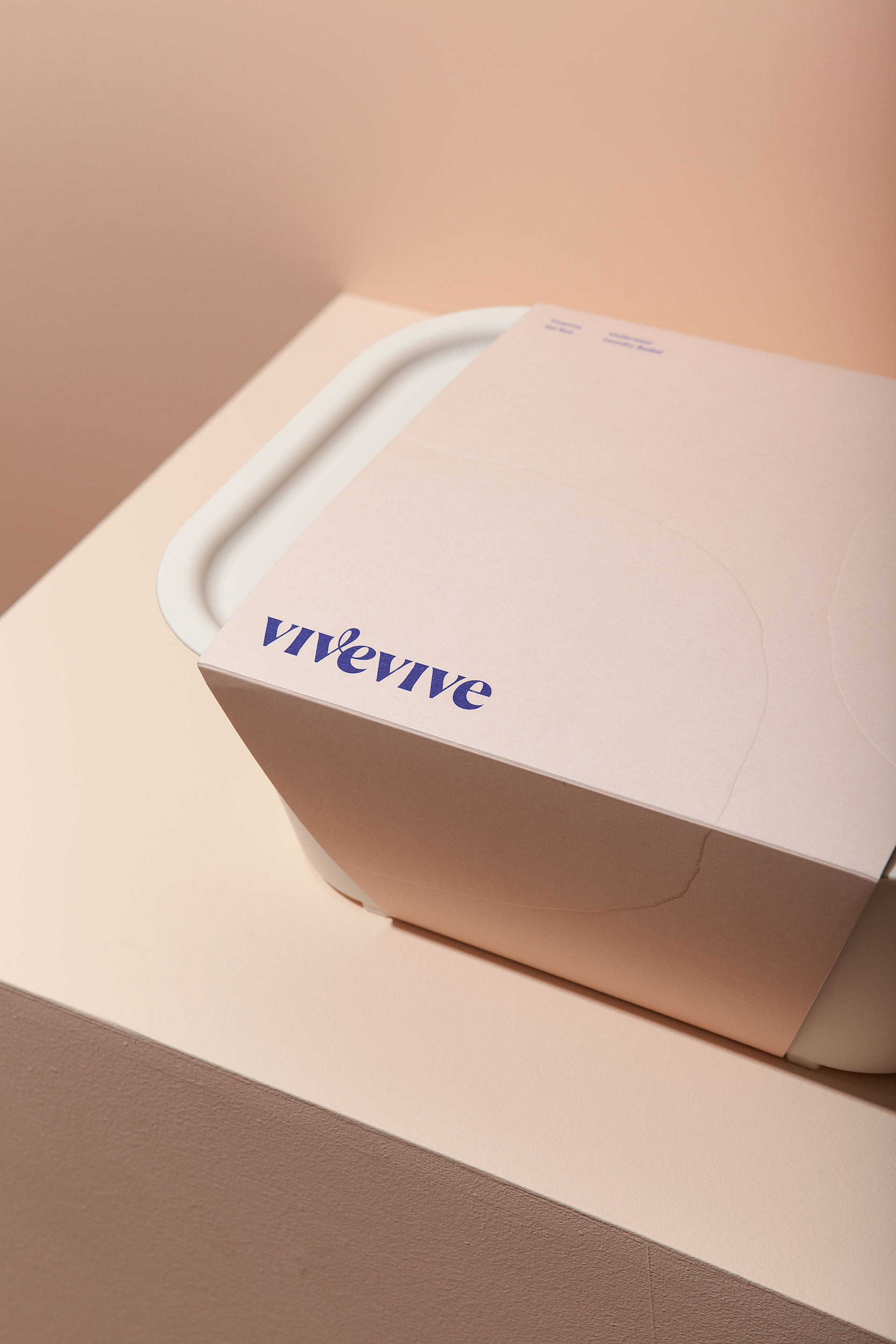
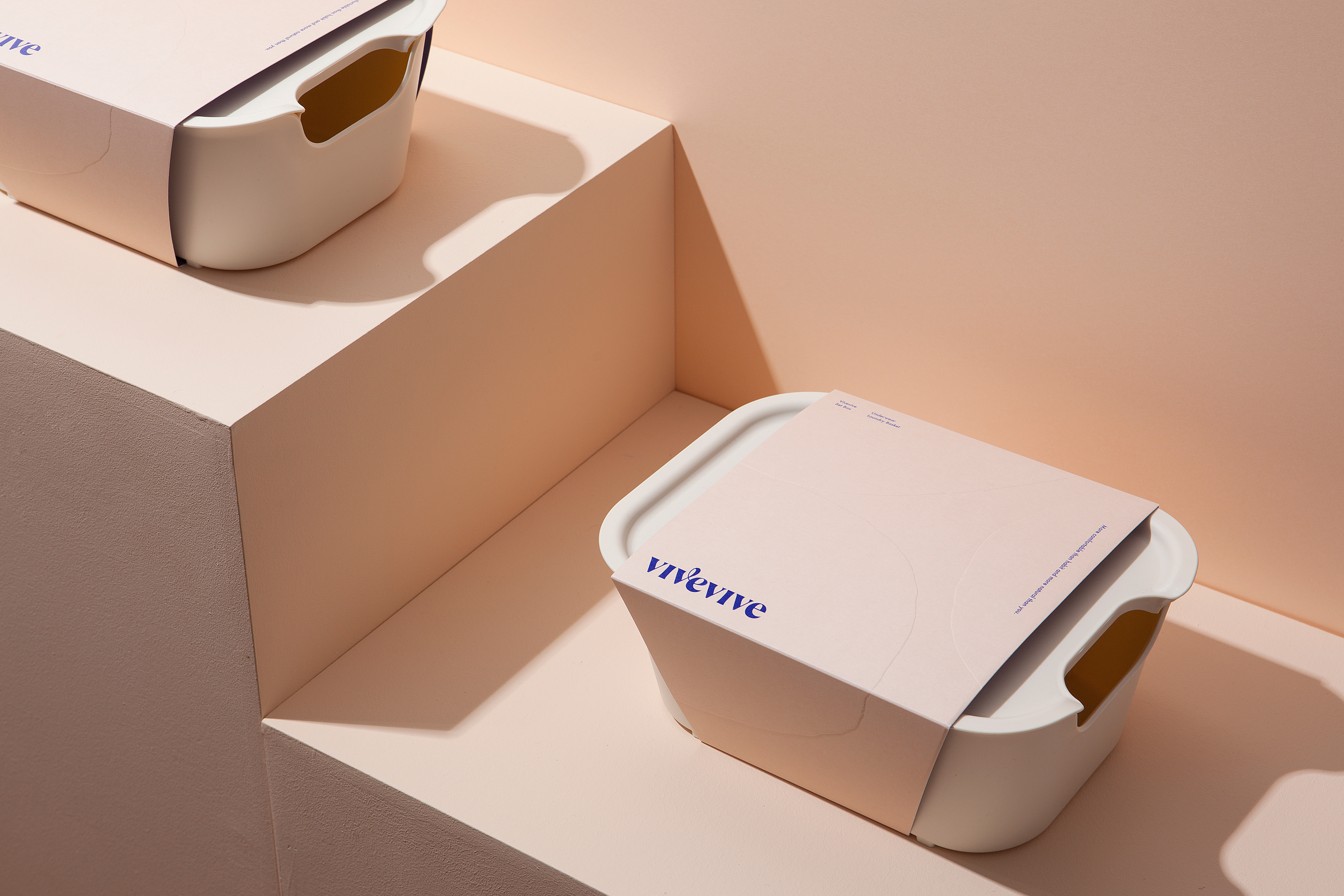
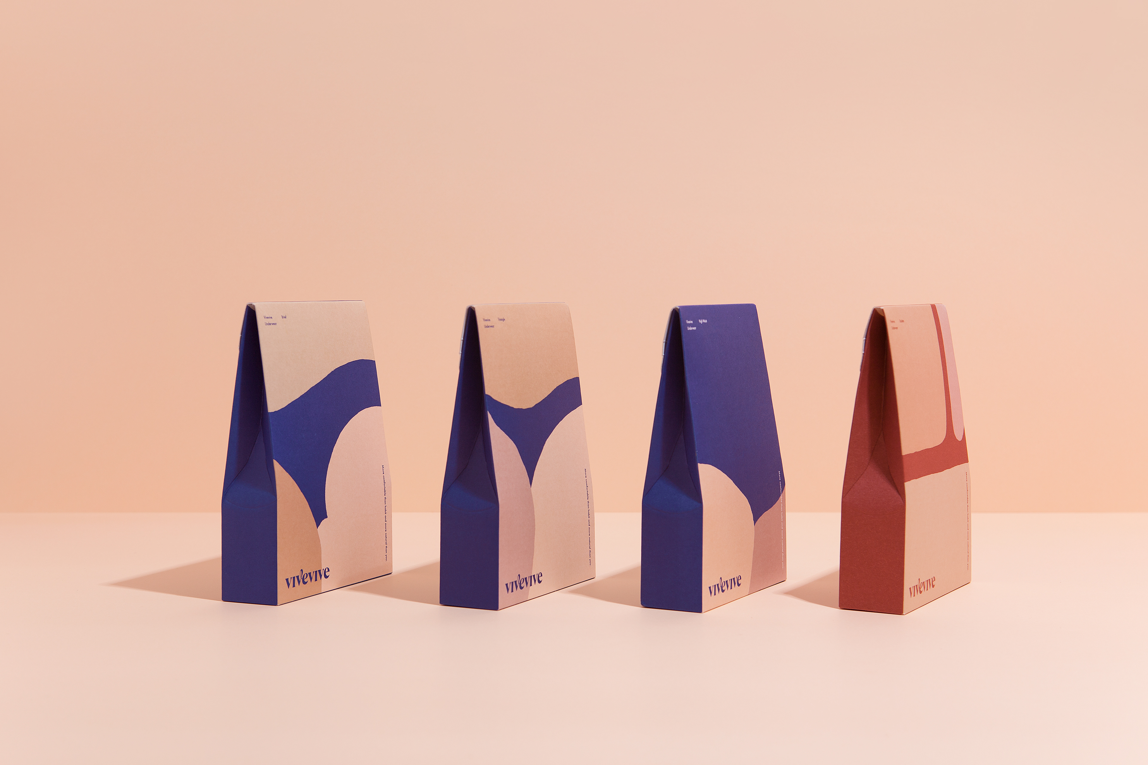
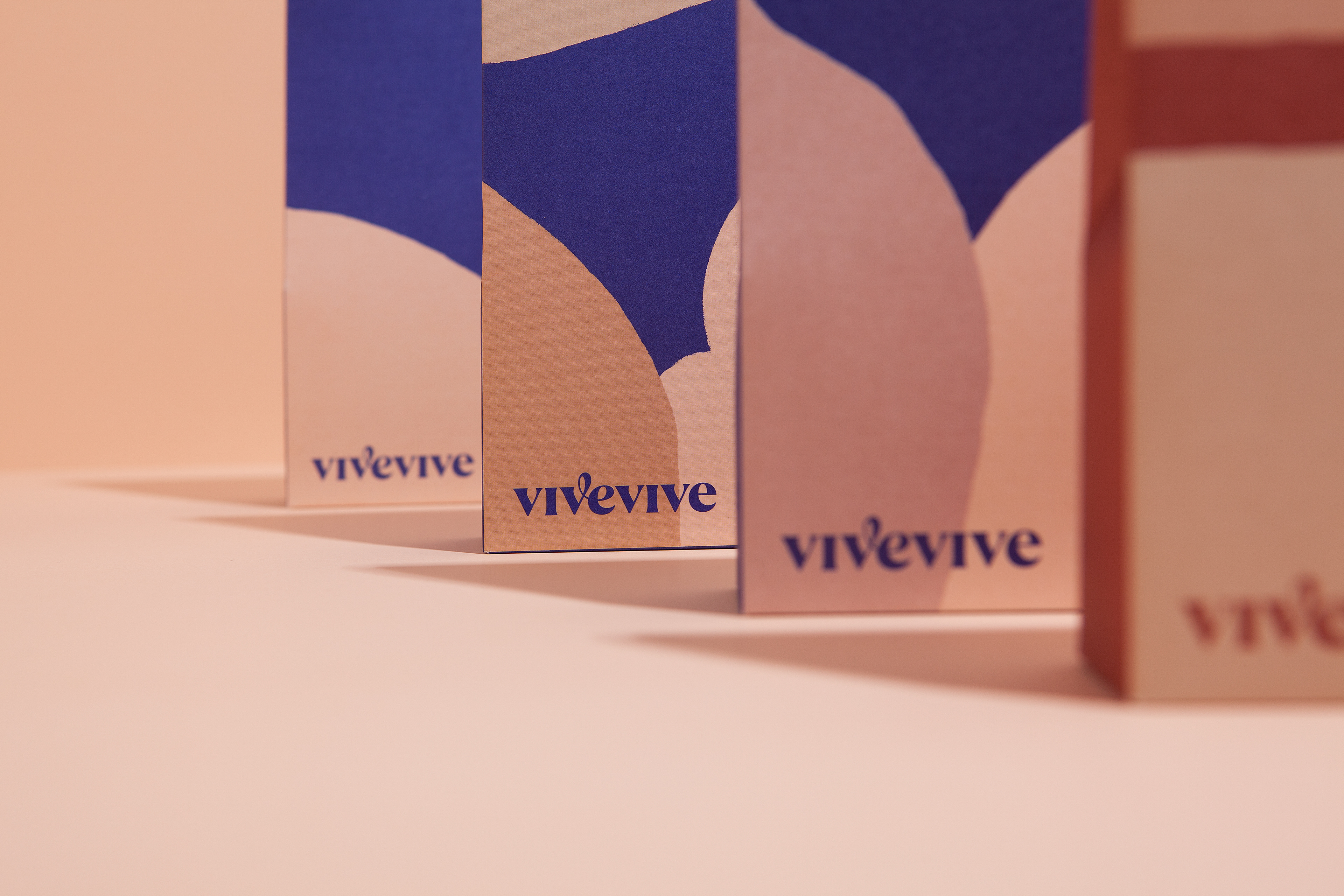
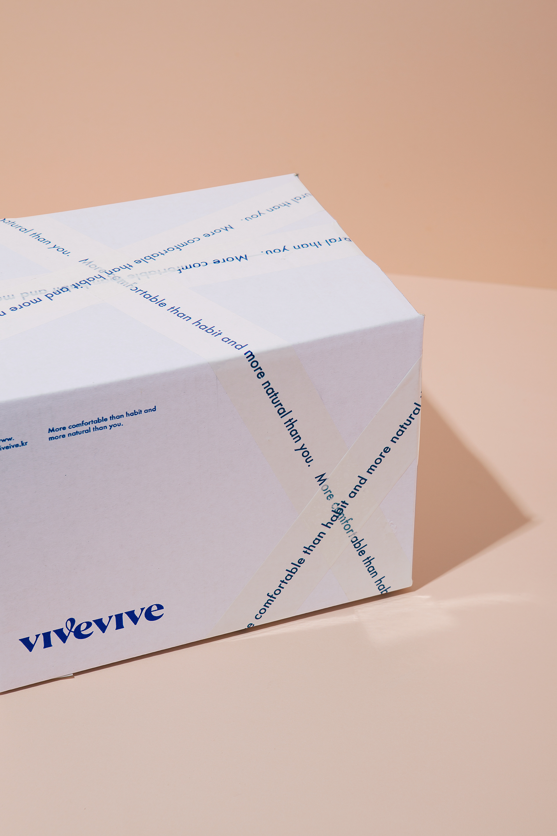
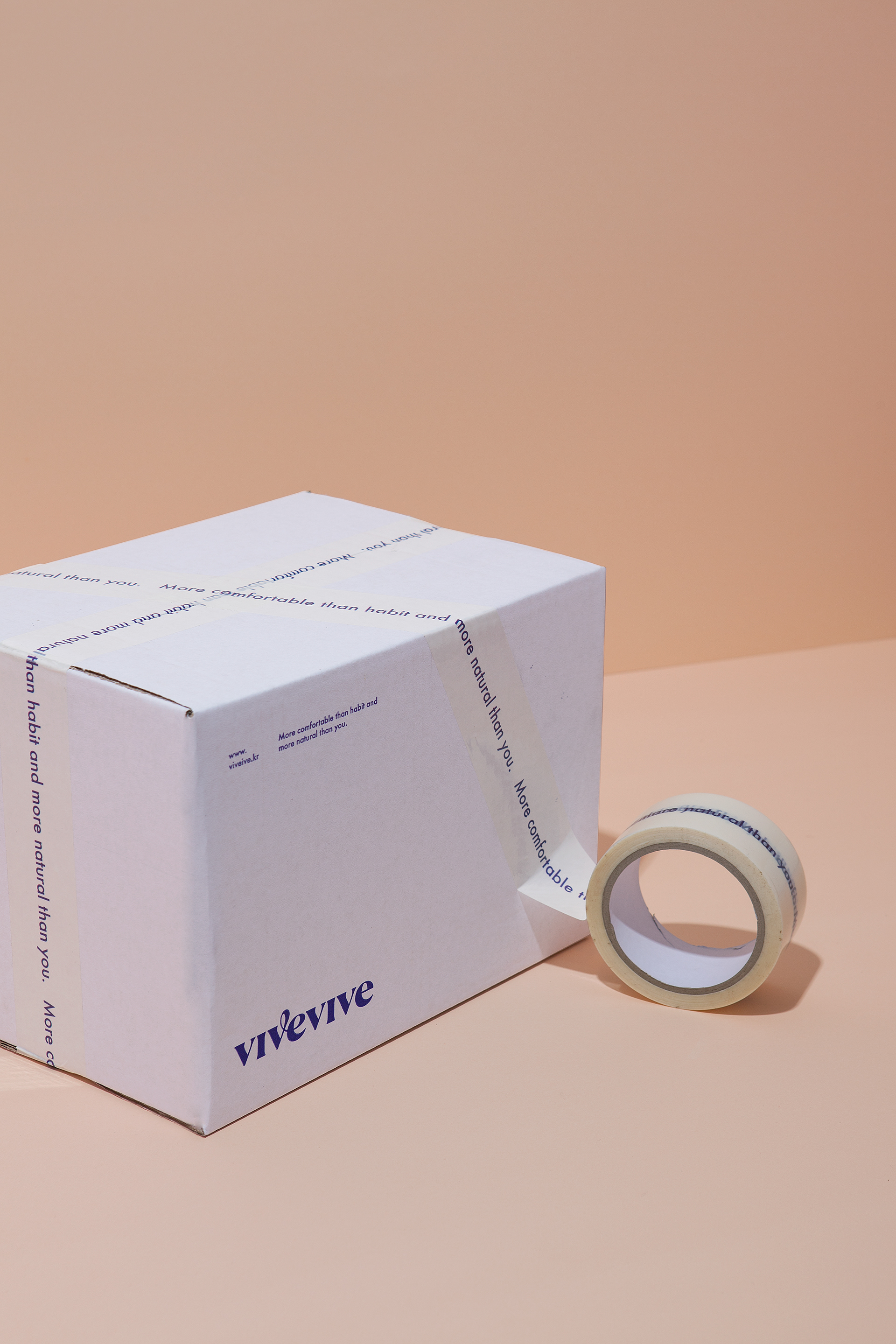
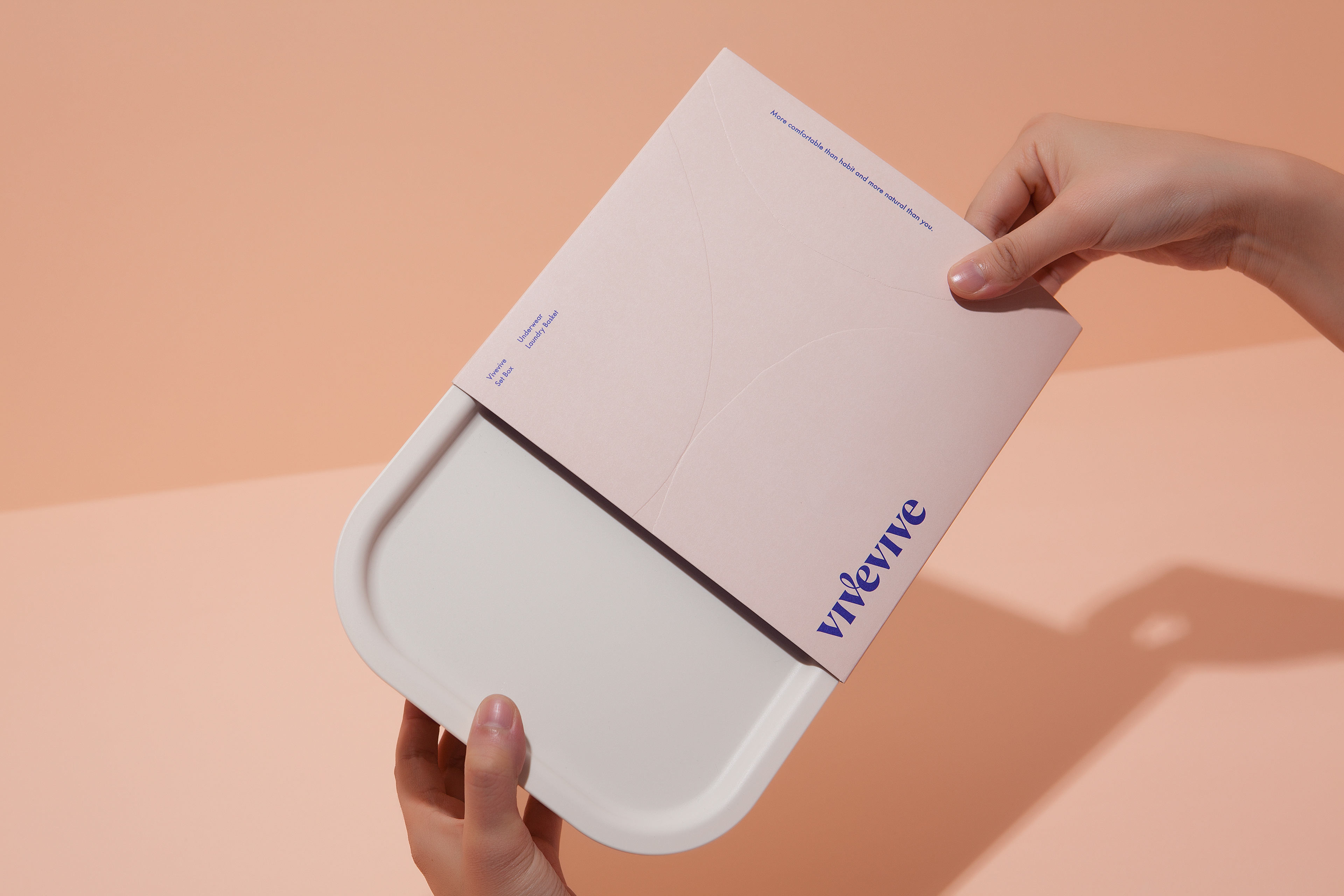
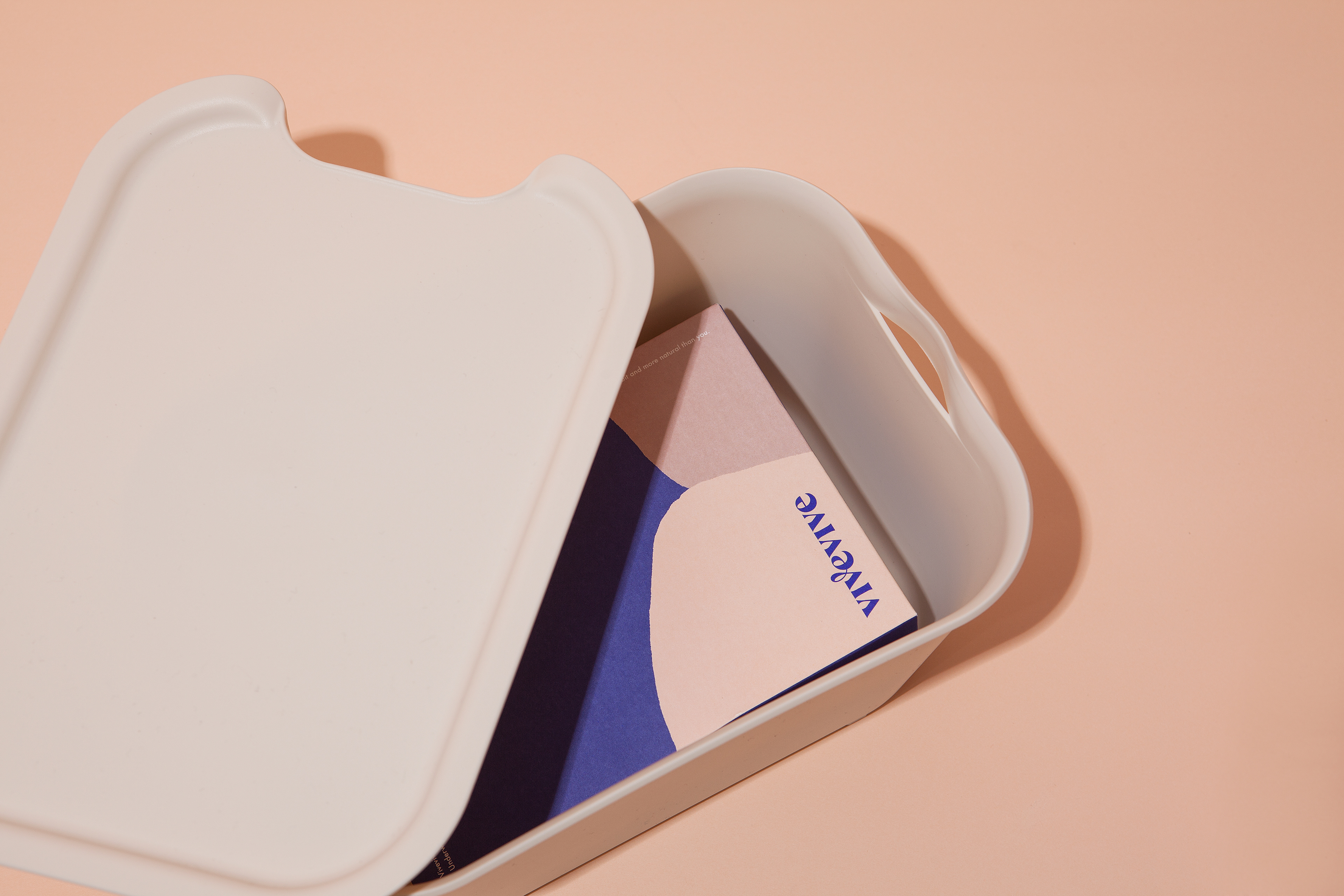
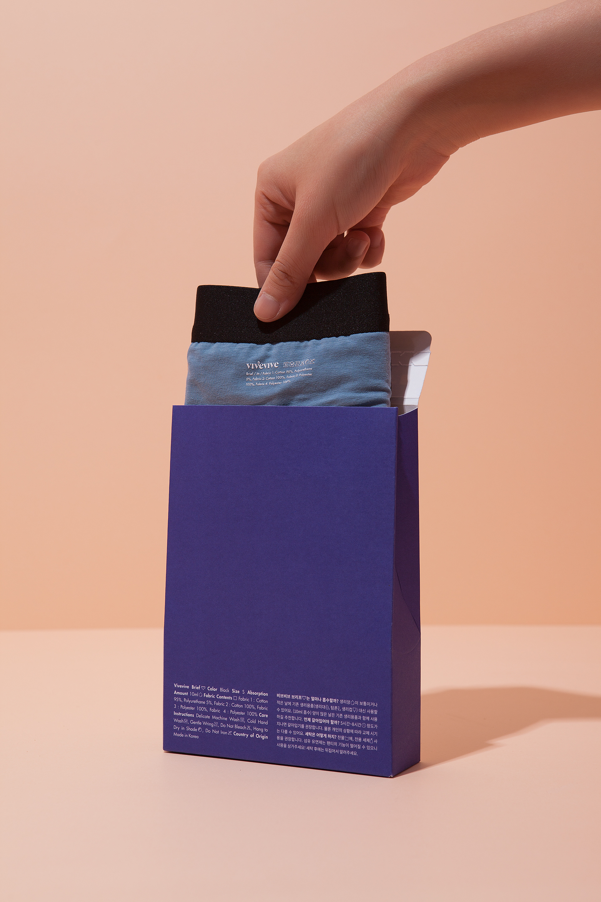
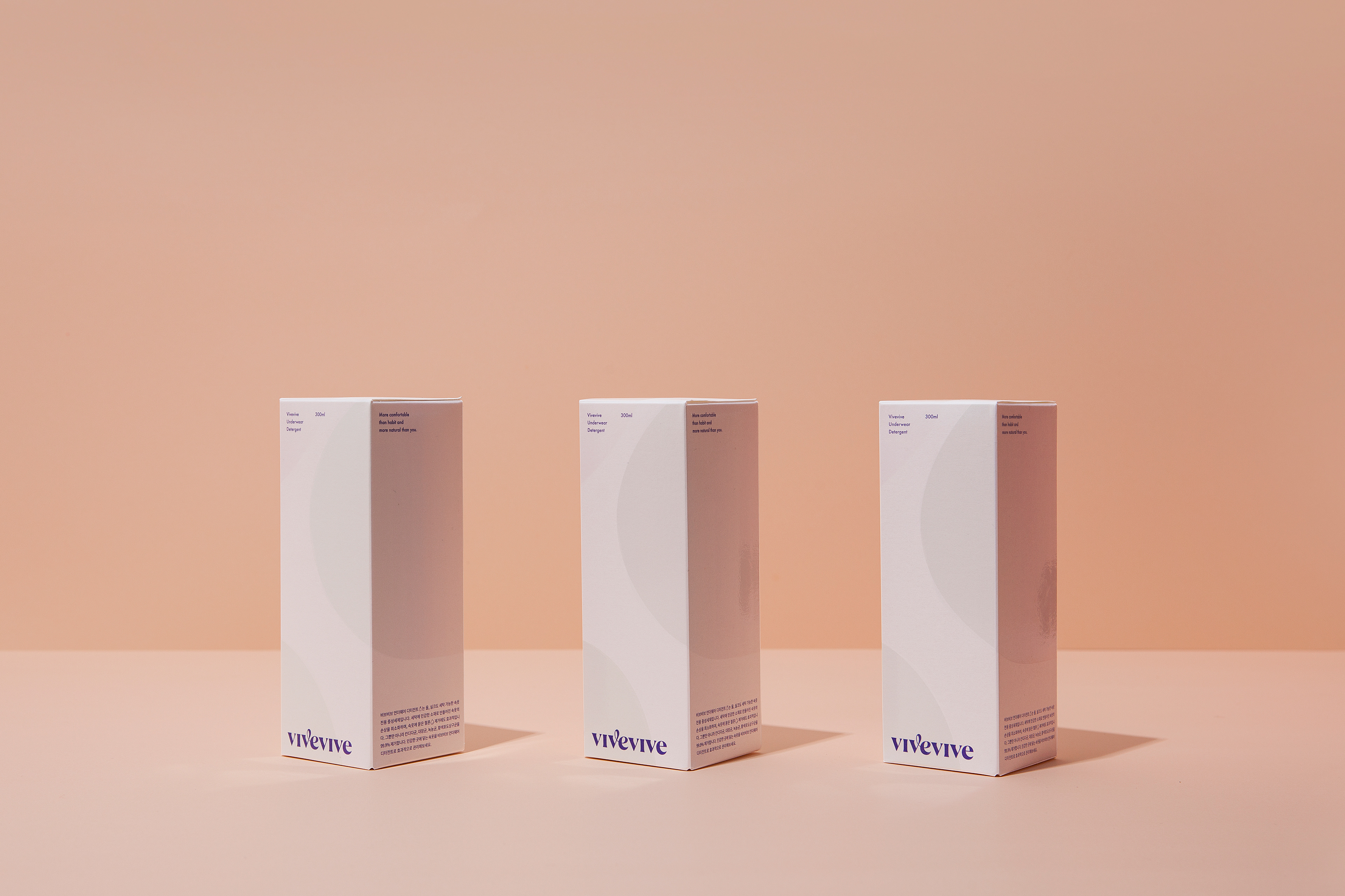
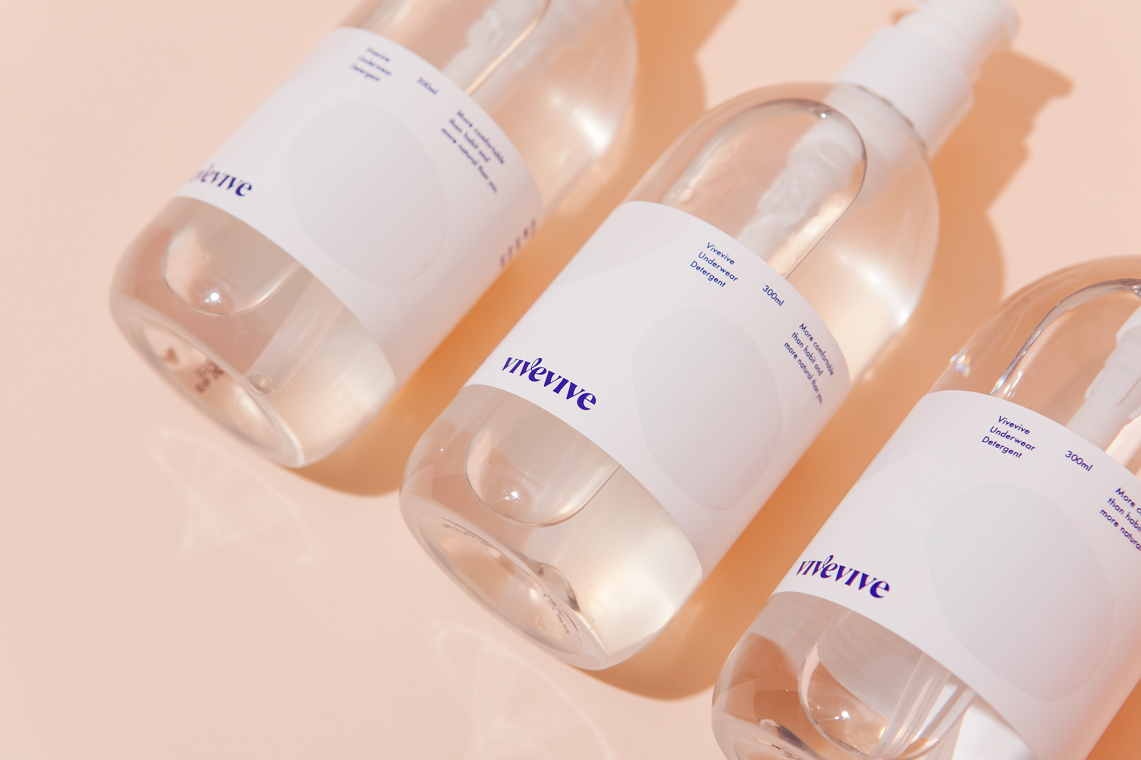
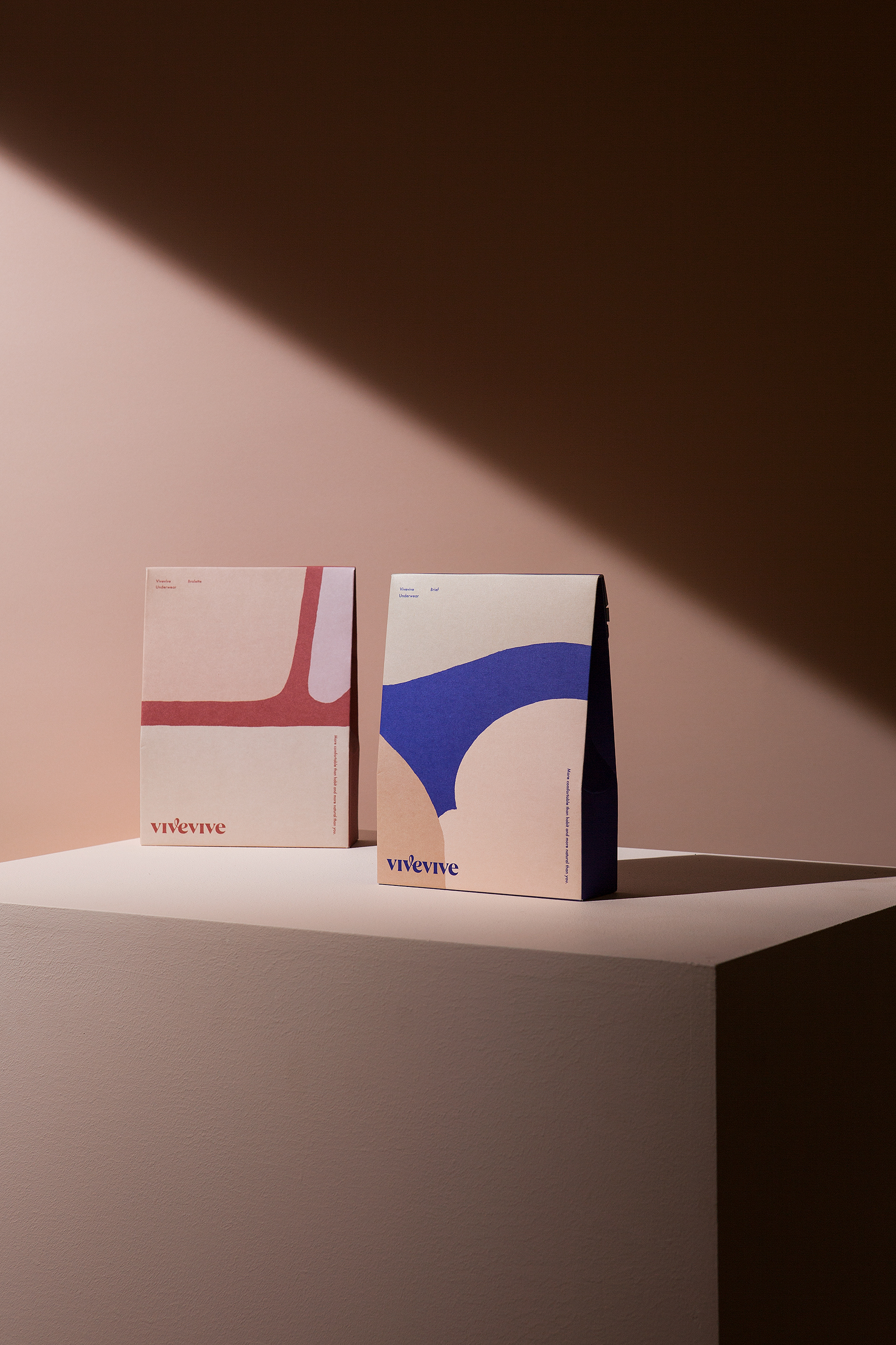
Vivevive Visual Identity & Packaging Design Development
2018
Client: Vieux et Nouveau (Blank Corp.)
Project Team
-
CFC
Visual Identity Development & Packaging Design Development
Art Direction & Design: Charry Jeon
Designer: Jiyoung Kim, Yoonji Nam, Minsun Lee
Product Photography: Kiwoong Hong
-
Blank Corp. Product Unit 2
Project Direction
Director: Sangvin Lee
-
Studio Boucle
Styling
-
Muted Studio
Lookbook Photography
www.contentformcontext.com